John Brand remarks that “ancient Egyptian hieroglyphics were probably the first real “commercial” examples of data visualization” (via @DashingD3js).
He references a historical visualization that was new to me. In 1858, Florence Nightengale’s visualization of cause of death in the Crimean War told a compelling story of the how the real enemies were cholera, typhus, and dysentery:

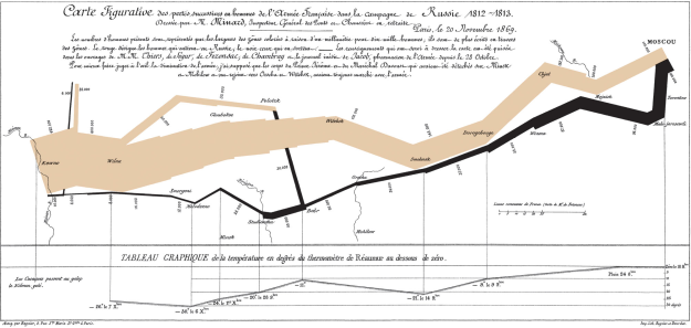
Edward Tufte highlights a similar story about Napoleon’s disastrous invasion of Russia in 1812, which maps the size of his army over space, time, and temperature:

I agree that visualization today is more an art than a science, but I believe it will always be so. Visualization is editorial. What we choose to highlight with shape, color and annotation tells the story. Our ability to collect data has far outpaced our ability to process and analyze that data. I believe there are many answers to urgent questions that lie dormant on personal hard drives and cloud storage.
I’ve been spending time with d3js, which is a fabulous, modern visualization framework. For now, it provides flexibility for rather sophisticated programmers; however, it is my hope that the tools will emerge that will allow any person with critical thinking skills to ask questions and tell stories by pouring data into images.
Here are some modern examples (with code!):
Small Multiples: stock prices over time, nested by symbol
Multiple Area Charts: an infographic with multiple area charts along with a context tool to zoom and pan the data.
Lots more examples in the d3js gallery.