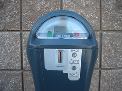
A year or two ago, new parking meters appeared by the train station in San Mateo. I suppose these were someone’s bright idea about how to save money by installing on one meter for two spaces:

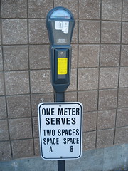
One can only assume that people were confused about how the meter worked, for not very long after signs appeared under each parking meter:
<a href="http://farm1.static.flickr.com/155/357189176_6c63a833ed.jpg?v=0"
This is one of my favorite examples of bad UI and a poor attempt to correct for it. Notice that the meter labels the spaces “left” and “right,” while the sign refers to “SPACE A” and “SPACE B.”